Bellville brief, kept tight and practical
The order came from a Bellville marketing team planning a short campaign around branded bottles for a local activation. The bottles had to look neat from arm's length and close up, with the logo staying legible on curved glass and on smaller drinkware pieces used alongside the main bottles.
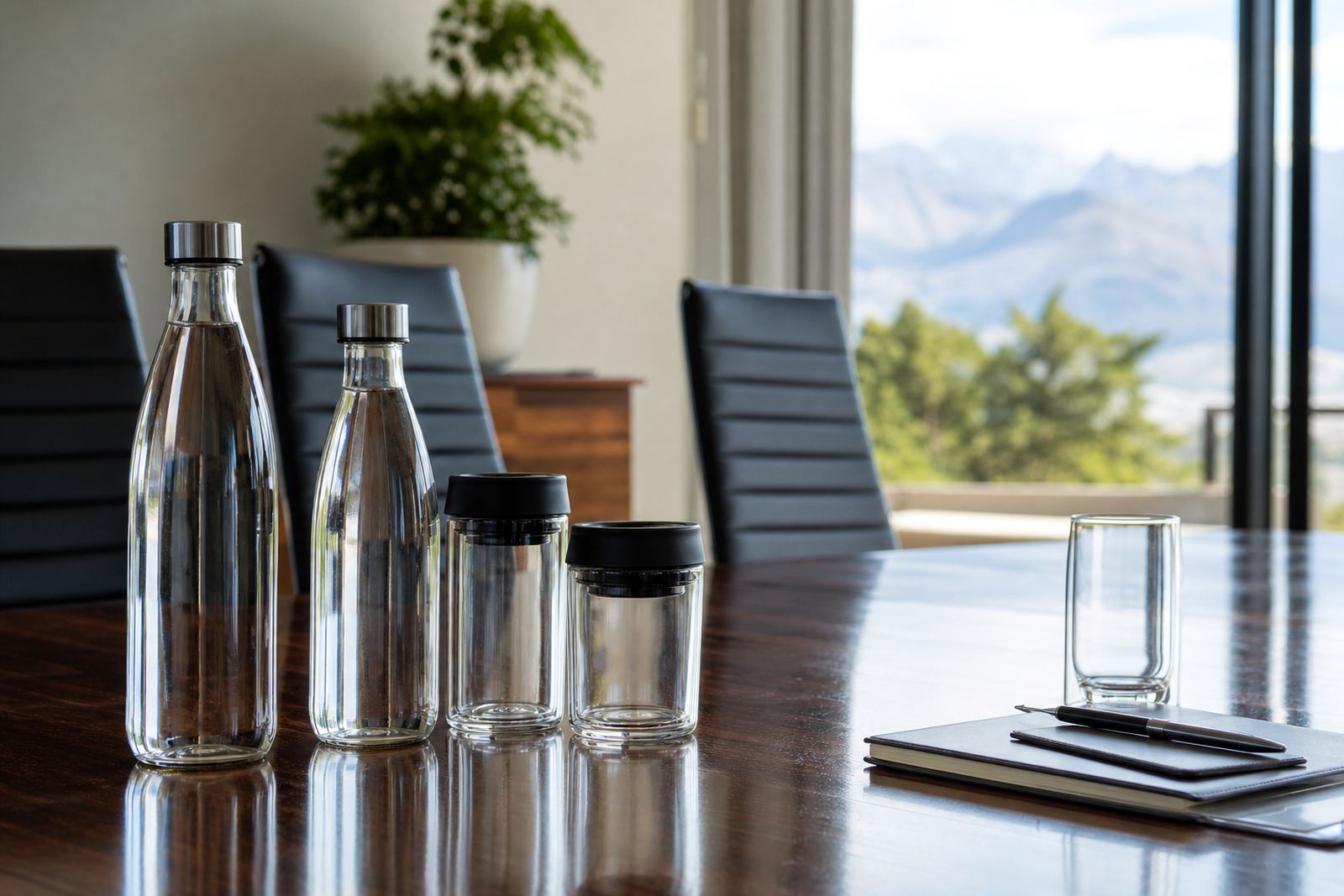
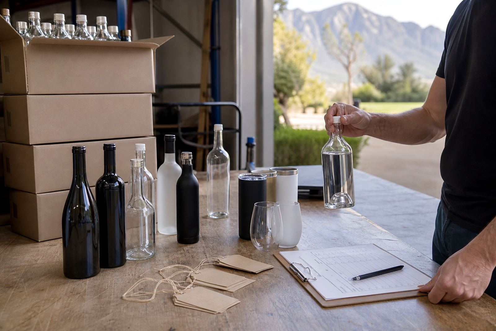
The brief called for compact quantities rather than a large trade run, so the artwork had to suit a smaller print batch without losing detail. We also had to keep the look consistent across wine style bottles, a few gin format bottles and matching water bottles for table use.
- Town: Bellville, Cape Town metro
- Project type: promotional bottle and drinkware run
- Order size: short run quantities
- Focus: neat logo placement and clean colour control
Decoration methods chosen for the mix
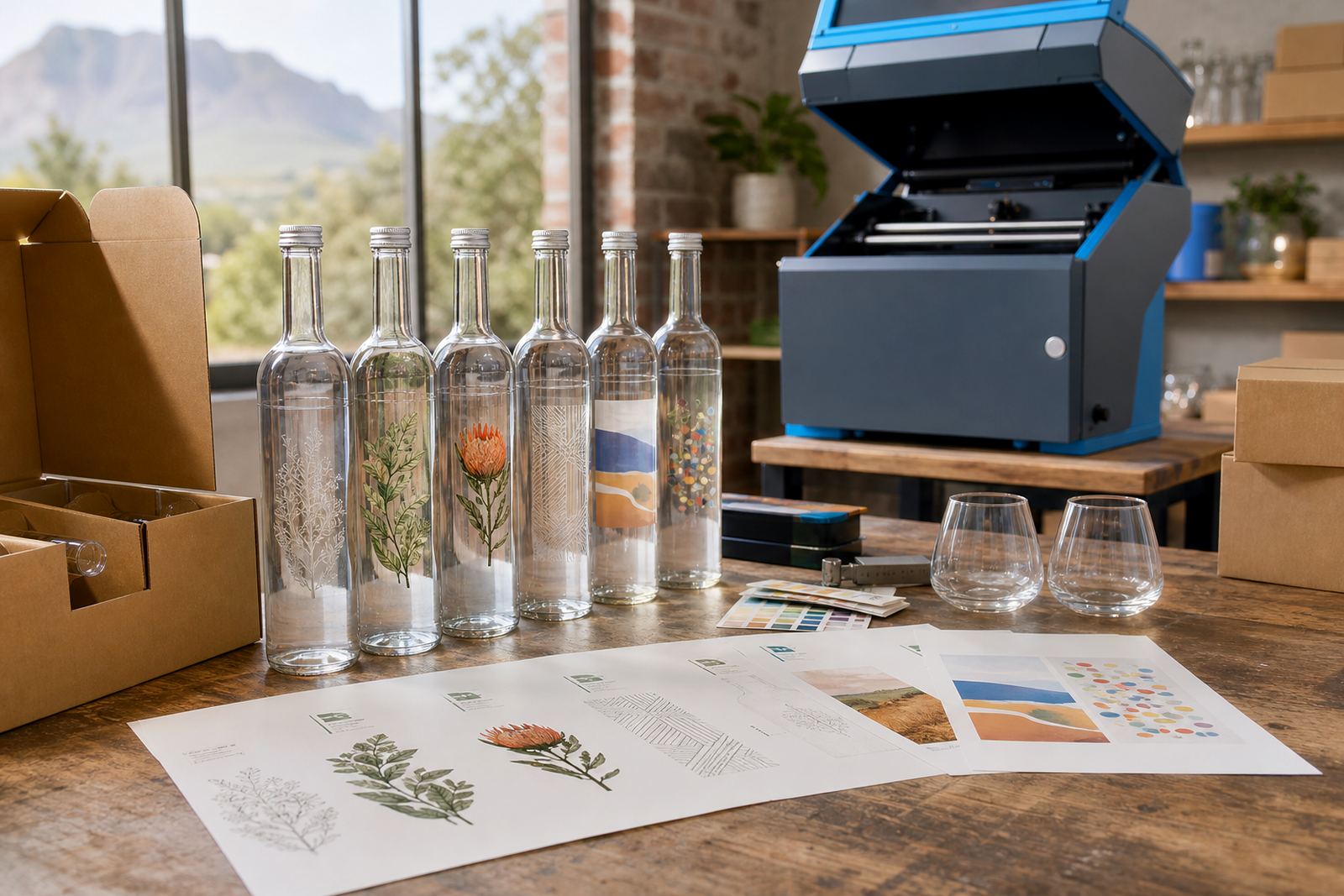
For this project we mapped the range to the right decoration methods rather than forcing one method across every item. Glass bottles with a long shelf life suit UV direct print well when the artwork needs sharp edges and strong opacity. Labels are useful where the bottle shape is awkward or where a campaign needs a flexible finish across a mixed pack.
Where the brief called for a more durable decorative finish on select drinkware pieces, ceramic enamel was considered for items that would be handled repeatedly. Screen printing also stayed in the mix for simpler artwork blocks and solid areas of colour. The goal was to match each surface to the method that would hold the artwork best, not the other way round.
- UV direct print for crisp logos on glass
- Screen printing for solid colour areas
- Ceramic enamel for harder wearing decoration on suitable drinkware
- Labels where shape and artwork size needed flexibility
Artwork checks before the press run
The supplied artwork needed a few practical adjustments before print. Curved bottles lose detail fast if the safe area is too wide, so we checked the wrap and confirmed the print panel against each bottle shape. White ink layers were added where the glass tone would have dulled the logo, and we set the colour notes so the print stayed consistent from one item to the next.
Mock-up visuals helped show where the logo sat on the shoulder and body of the bottle. Proof approvals were issued before production moved ahead, which let the client see the final placement and spacing before anything went to press. On a short run, there is less margin for error, so those checks carry more weight.
- Artwork checks for curve and panel size
- White ink layers for dark or tinted glass
- Mock-up visuals for placement sign-off
- Proof approvals before the final run
What the short run involved in Paarl
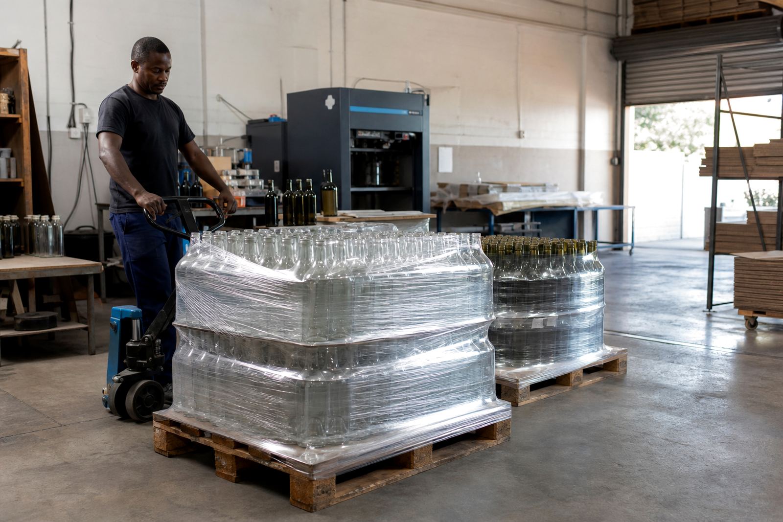
The run was prepared in Paarl, with the bottle pack sorted, labelled and packed for delivery into the Cape Town area. We worked through print area planning first, then moved into UV print prep and screen print prep where needed. The mix of bottles and drinkware meant each item type was grouped by decoration method so the production line stayed neat.
Minimum run advice formed part of the job as well. The client did not need extra stock sitting in storage, so we kept the order aligned to actual campaign demand. That kept the run compact and manageable while still giving enough pieces for the planned promotion.
- Print area planning for each bottle type
- UV print prep for the glass bottles
- Screen print prep for the simpler pieces
- Packing brief set for safe transport
The timeline from approval to delivery
The project moved through proofing and production in a short weekly cycle. Week one covered artwork checks, layout changes and proof approval. Week two handled printing, drying and packing, with the final delivery set up for the Bellville campaign window.
That timing worked well for a promotion with fixed launch dates and limited space for excess stock. The client had bottles ready for displays, gifting and event use without carrying more units than needed. The compact run also made it easier to keep every piece visually consistent.
- Week 1: artwork, proofs and method selection
- Week 2: printing, packing and delivery prep
- Delivery area: Bellville with Cape Town distribution support
- Use case: campaign tables, gifting packs and display bottles
What the finished bottles needed to do
The finished order had one job, to look polished in a busy promotional setting. The logo stayed readable on the smaller bottles, and the artwork sat square on the glass without drifting into the shoulder or base curves. The client also needed the pieces to look good beside each other, even with different bottle formats in the same campaign.
Neat packing mattered too, because the order was headed for direct use rather than long storage. The bottles arrived ready for the promotion team to place on counters, carry to the venue and hand out where needed. Nothing about the run needed heavy explanation on site, which is what a short campaign usually calls for.
What we would set up for a Bellville campaign
Artwork checks would come first for a Bellville run, followed by proof approval and then matching the print method to each bottle type. That order protects small campaigns from avoidable rework and gives the client a clearer view of how the logo will sit on glass or drinkware.
We would also keep the print brief tight on quantities and bottle mix. Short promotional orders move better when every item has a known surface, a set decoration method and a packing note that suits the delivery route. That keeps the job practical from the first file check to the last packed carton.
Key facts
| Project | Bellville promotional bottle run |
|---|---|
| Client type | Local campaign team |
| Town | Bellville, Cape Town metro |
| Products | Wine bottles, gin bottles, water bottles and drinkware |
| Decoration methods | UV direct print, screen printing, ceramic enamel and labels |
| Process | Artwork checks, mock-ups, proof approvals and packing briefs |