A tasting line-up built for Hermanus service tables
The brief came from an events team in Hermanus preparing a tasting series with mixed drinkware, small bottles and a few gift packs for guests. The visual line needed to feel polished without pushing the artwork too hard on curved glass, and the finished pieces had to hold up in a coastal setting where mist and damp evenings are part of the week.
We mapped the job around short-run production, with a clean layout that could work across wine bottles, gin bottles and water bottles. That meant deciding where the logo would sit, where the small type could stay readable, and how much white ink was needed behind the colours so the artwork did not fade into the glass.
- Project type: tasting-focused sample bottle run
- Location: Hermanus event series
- Use: tasting tables, guest packs and display stock
- Range: branded bottles and selected drinkware
Artwork checks, white ink and bottle shape planning
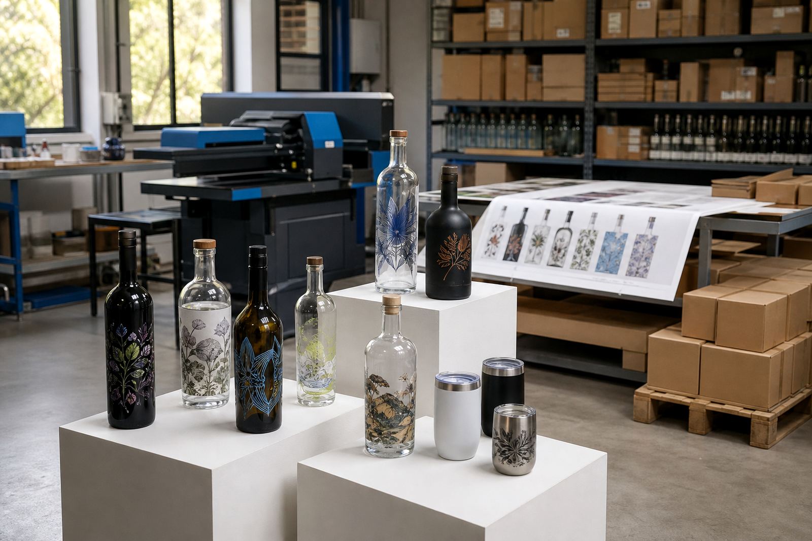
The supplied artwork arrived with more detail than the bottle shoulders could carry, so the first step was print area planning. We trimmed fine elements, adjusted spacing around the text, and built proof visuals that showed how the decoration would sit on each bottle profile. A tall bottle needs a different balance from a shorter drinkware shape, and the print area has to respect the curve or the design starts to wander.
For the darker glass pieces, we added white ink layers under the main colours so the mark stayed strong against the bottle surface. That mattered on the smaller tasting units, where a weak underbase would have made the brand look thin from a distance. Labels were also considered for a few items where a printed wrap made more sense than direct decoration.
- Artwork cleaned for bottle curvature and small text
- White ink planned for darker glass backgrounds
- Mock-up visuals supplied before production
- Label artwork set up for mixed-format items
Decoration methods matched to the container mix
The order used more than one decoration method because the range included different finishes and bottle sizes. UV direct print suited the tighter graphics and short-run work, while screen printing gave a solid look on selected glassware with simpler artwork. Ceramic enamel was reserved for pieces needing a more durable fired finish, and labels handled the items where shape or surface texture made direct print less practical.
That mix kept the run practical for the event team and avoided forcing every item through the same process. We also checked how each method would sit on the glass after filling, handling and display, because a tasting bottle is handled much more often than a shelf sample. Small alignment differences matter, especially when the same set has to look consistent across several tables.
- UV direct print for short-run branding and detail
- Screen printing for simpler, strong-colour artwork
- Ceramic enamel for a more durable fired finish
- Labels where shape or surface needed a different approach
Short-run quantities, packing notes and delivery lanes
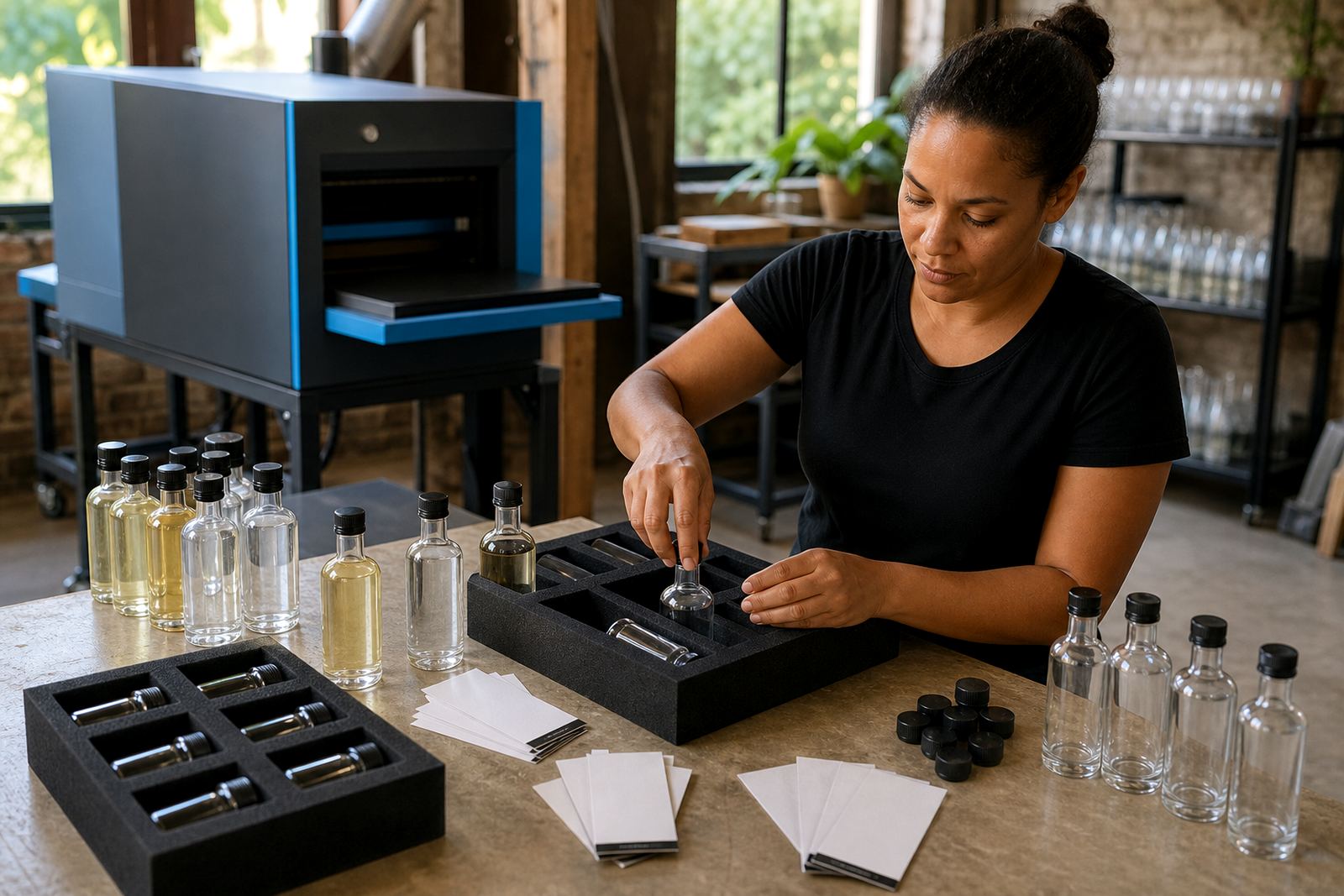
The run was kept to a minimum that suited the event series without leaving excess stock behind. We packed the bottles in display-friendly groupings, then separated the delivery list so the Hermanus set could move with the right mix of items for staging and replenishment. The logistics brief covered handling notes, carton marking and where the tasting team needed the packs to land on arrival.
Because the job involved a few destinations and a fixed event window, the packing brief had to be plain and practical. Some pieces travelled to Cape Town for support stock, while others were routed for use closer to the coast. The project stayed focused on clean presentation and safe movement, not on oversized quantities that would sit unused after the series ended.
- Short-run quantities matched to event demand
- Cartons marked by bottle type and artwork version
- Packing notes supplied for staging and distribution
- Delivery planned for Hermanus with South African routing support
Three weeks of production from proof to packed cartons
The work ran over three weeks from artwork refinement through to final packing. Week one focused on checks, layout adjustments and proof preparation. Week two covered print preparation, method matching and test alignment. Week three moved into printing, curing where needed, inspection and carton packing.
The schedule gave our team time to fix small issues before the full run moved ahead, which was more useful than pushing for speed alone. That matters on short promotional work, because a single misplaced line on a curved bottle can throw off the whole display set. The final packs left with consistent placement, strong colour balance and a cleaner look than the rough artwork could have managed on its own.
- Week 1: artwork checks and proof visuals
- Week 2: print prep and method selection
- Week 3: production, inspection and packing
What the tasting set achieved at the event series
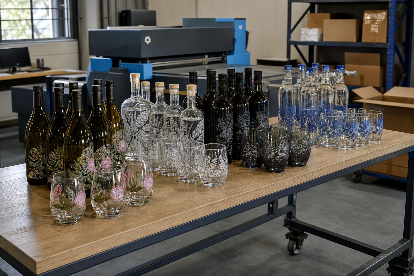
The finished bottles gave the Hermanus series a more deliberate table presence, with each item reading clearly from a short distance and holding its shape in photographs. The range worked across drink types without looking pieced together, and the client could use the same visual language on tasting stations, welcome packs and gifting stock.
Proofs were signed off before print, white ink went on the darker glass, and each bottle got its own decoration method instead of one process for the whole set. That kept the result tidy and practical. It also gave the event team enough flexibility to use the stock across different rooms and service points without the set feeling mismatched.
- Clear branding across mixed bottle and drinkware types
- Better legibility on curved glass surfaces
- Consistent look across tasting and gift use
- Flexible stock for different event areas
Key facts
| Project | Hermanus tasting-run bottle project |
|---|---|
| Client type | Event series organiser in Hermanus |
| Containers | Wine bottles, gin bottles, water bottles and drinkware |
| Decoration methods | UV direct print, screen printing, ceramic enamel and labels |
| Artwork support | Artwork checks, mock-up visuals, proof approvals and label setup |
| Timeline | 3 weeks from proofing to packed cartons |