George estate brief and the table look
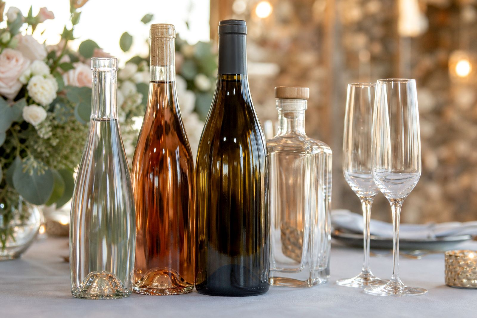
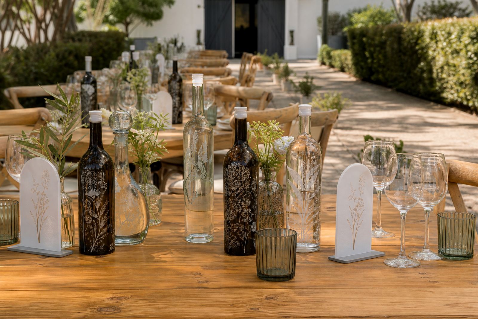
The job came from an estate team in George planning a hosted function with mixed serving points, gift tables and branded keepsakes. They wanted the bottles and drinkware to present as one coordinated set, with a consistent look across all items on the tables and service points. The setting asked for a calm visual finish, with labels and print placement that stayed neat on glass, even where light caught the surface at angles.
The order covered wine bottles, small gin bottles and a set of drinking glasses for front-of-house use. The estate did not need a heavy sales look. It needed a refined finish that matched the tone of the property and worked across a few item sizes. That meant tight artwork placement, clear artwork approval and a method choice that suited each substrate.
- Bottle types included wine bottles, gin bottles and clear water bottles.
- Drinkware included stemless glasses and straight-sided glasses.
- The run was kept short to suit event quantities and storage space.
Artwork checks, proofing and print planning
The first step was artwork checking. The supplied artwork needed size checks, edge clearance and colour review before anything could move into production. With glassware, small changes in line weight and logo position matter more than many clients expect, so we checked the print area against each bottle shape and each glass profile. That helped prevent marks sitting too close to curves, seams or shoulders.
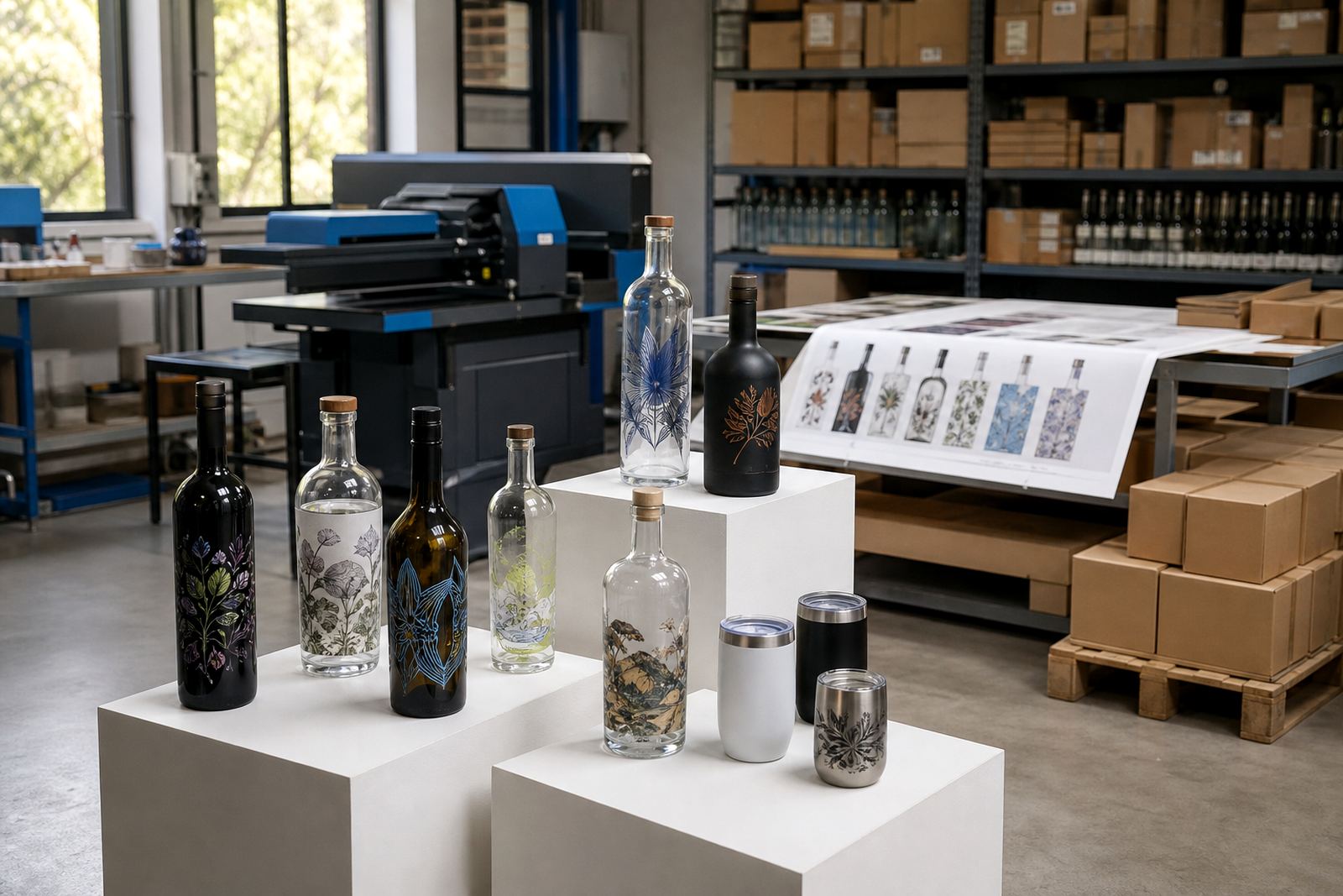
We prepared proof visuals for each item type so the estate team could see where the artwork would sit on the bottle or glass. White ink layers were added where needed, especially on darker glass or where a coloured mark needed stronger visibility. Labels were also planned for the items that suited a pressure-sensitive finish better than direct print. The proof stage is useful on mixed orders because it shows how one artwork can behave across different surfaces.
- Artwork checks covered sizing, line thickness and clear space.
- Proof visuals showed each item on its own surface.
- White ink layers were planned where opacity mattered.
Decoration methods used on the run
Three decoration methods were used across the order. UV direct print suited the cleaner, flatter areas and gave a crisp finish on glass and some coated drinkware pieces. Screen printing worked well where the artwork needed a stronger solid colour and a more traditional applied look. Ceramic enamel was selected for items where a fired finish was more suitable for handling and presentation. Labels were kept in the mix for bottle shapes that needed flexibility around curves or where the quantity made that route more practical.
Each method has its own setting limits. UV direct print is useful when the artwork must sit neatly on short runs and the bottle shape allows a controlled print area. Screen printing needs the artwork set up for colour separation and placement consistency. Ceramic enamel asks for careful prep before firing. Labels need accurate cut sizing, adhesive choice and clean application so the finish does not curl at the edges. The George estate order used the right mix of methods rather than forcing one method onto every item.
- UV direct print for crisp placement on suitable glass surfaces.
- Screen printing for stronger solid colour areas.
- Ceramic enamel for a more permanent fired finish.
- Labels for flexible bottle shapes and short-run practicality.
Packing the bottles for an estate event
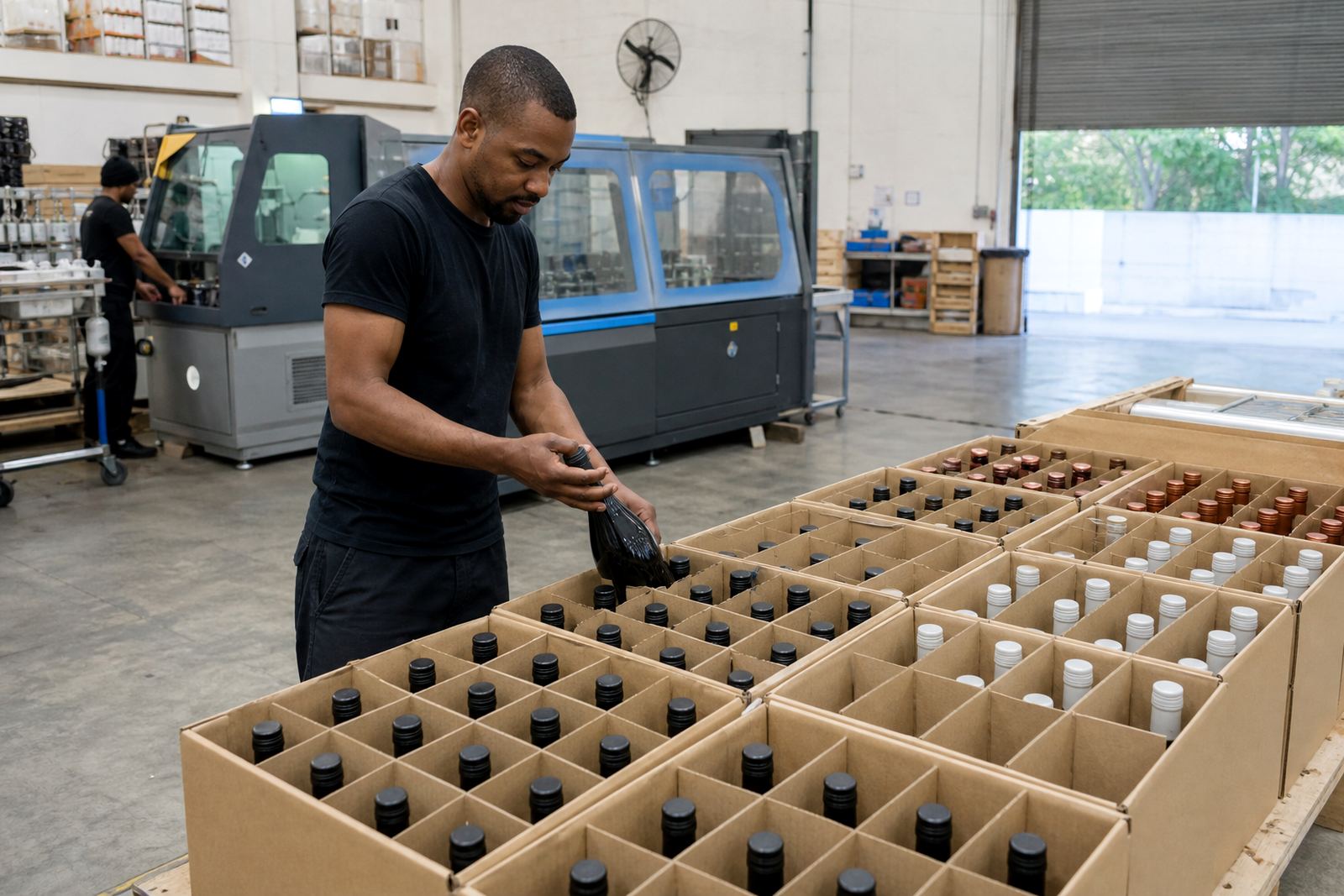
The packing brief mattered because event stock gets handled more than retail stock. Bottles had to reach George ready for table placement, tray service and gifting. We packed the items so the printed faces stayed protected and the mixed order stayed easy to sort on site. The team also asked for the packs to be marked by item type, which helped the event crew separate wine, gin and water pieces without opening every carton.
Drinkware was wrapped with care around rims and printed zones, and the bottles were packed to reduce rubbing during travel. George sits far enough from Paarl that the load needed proper internal spacing and carton discipline. A mixed order like this is about more than print alone. If the packing is weak, the surface finish takes the damage before the first glass is poured.
- Cartons were grouped by item type for easier setup.
- Printed areas were separated to reduce surface contact.
- Pack labels helped the event team sort stock quickly.
The four week production path
Over four weeks, the order moved from artwork review through production to dispatch. The early stage focused on proofing and setup for the different methods. After approval, the production sequence moved through print preparation, method-specific application and final checks. Mixed jobs like this need spacing in the schedule because labels, direct print and enamel work do not follow the same path. One method may be ready while another still needs curing or finishing.
That longer path also gave room for minor corrections where needed. A short-run estate order often changes slightly during planning, especially if the client adjusts bottle counts or swaps an item type. Keeping the workflow orderly mattered more than trying to rush through each stage. The result was a clean hosted presentation that matched the setting and the serving plan.
- Week 1 covered artwork checks and print area planning.
- Week 2 covered proof visuals and approval.
- Week 3 covered production across the chosen methods.
- Week 4 covered packing, final checks and dispatch.
What carried through to the finished event
The finished order worked because the printed items felt connected across the table instead of competing with one another. Bottles and drinkware carried the same visual language, but each item kept a finish suited to its surface. The estate team wanted a presentable hosted look, not a busy one, and that is where good print area planning pays off. A smaller logo placed correctly often does more for the table than a larger mark pushed into a poor position.
For a project in George, consistency matters in the final room rather than only in the artwork file. Glass, labels and print all catch light differently, so the look has to hold together under service conditions. This run showed that short quantities can still look considered when the prep is done properly and the carton plan makes sense at delivery.
- Visual consistency stayed intact across bottles and drinkware.
- The finish suited a hosted estate setting.
- The items were ready for table placement and gifting use.
If we set up a similar estate run
For a similar estate order, the most useful steps are still the same: confirm the item mix early, check the printable areas on every shape and decide where labels work better than direct print. Item-by-item proofs suit an estate order better than one loose composite sheet, because approvals stay clearer when several bottle sizes and drinkware styles are included. It also helps when one colour needs a white base and another does not.
We would also keep the packing instructions tied to the event setup. When a client has front-of-house tables, gift stock and reserve cartons in one order, the carton map matters nearly as much as the artwork. That is the practical part of a short-run estate job. The print is important, but the setup at the venue decides how smoothly it all lands.
- Item-by-item proofing keeps approvals clear.
- Mixed method planning avoids forcing one finish onto every surface.
- Carton marking helps the venue team place stock correctly.
Key facts
| Project | George Estate Run |
|---|---|
| Client type | Estate event team |
| Location | George |
| Items supplied | Wine bottles, gin bottles, water bottles and drinkware |
| Decoration methods | UV direct print, screen printing, ceramic enamel and labels |
| Production window | Four weeks |