A matched set for a Claremont celebration
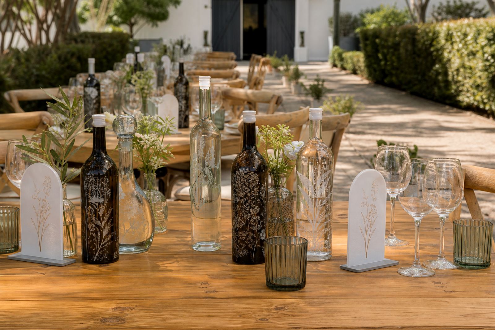
The brief came through for a wedding in Claremont where the couple wanted bottles and champagne flutes to feel like one family of items, not separate print jobs. The set had to carry the same names, date and motif across glass surfaces with enough consistency to sit neatly on the tables and in the gift boxes.
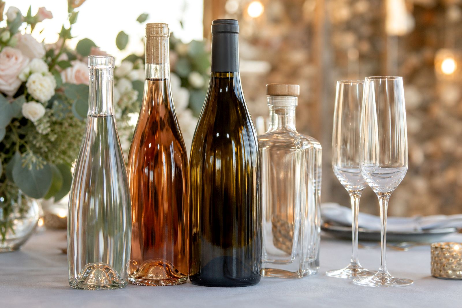
The order included a mix of bottle sizes and drinkware, with the main focus on presentation and finish rather than large volume. We worked with the layout in mind from the start, because curved glass, narrow shoulders and stemware all behave differently under print. That matters when the pieces must line up visually on the day.
- Wedding bottles for table display and gifting
- Champagne flutes for the toast set
- Matched artwork across different glass shapes
- Short-run production for a specific event count
Artwork, curves and the space around each mark
The artwork carried names, the wedding date and a compact motif. On glass, the usable print area is often smaller than the client expects, so we checked each item type for taper, shoulder curve and stem clearance before locking anything in. The bottle label zone and the flute print zone were treated separately, even though the visual language stayed the same.
For a job like this, white ink layers can be useful on dark or tinted glass, while clear glass may need a different build-up to keep the colour from disappearing. We also paid attention to how the artwork sat against reflections and table lighting, because wedding pieces are often viewed under bright function venue light and candlelight too.
- Print area planning for curved glass
- White underlayer checks where needed
- Artwork proofing before production
- Consistent spacing across bottle and flute sets
Decoration methods used on the run
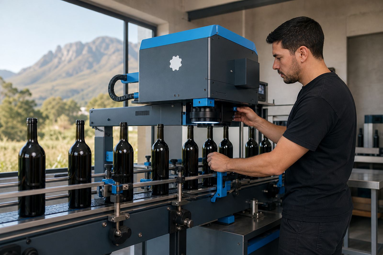
The project called for a practical mix of decoration methods rather than a single approach. UV direct print suited parts of the run where crisp detail and a clean finish were needed. Screen printing was considered where repeat artwork on glass could be held steady across the batch. Labels were part of the solution too, especially for pieces that needed flexibility around shape or when the surface area was too limited for direct print.
Ceramic enamel is another route for glass that must take more handling and washing, though it depends on the item and the visual target. For this wedding, the final plan balanced appearance, run size and the way the bottles and flutes would be packed and presented. Not every item needs the same process, and that sort of split is often what keeps the set looking tidy.
- UV direct print for sharp detail and small runs
- Screen printing for repeatable glass decoration
- Labels for flexible placement and shape control
- Ceramic enamel where a fired finish is the better fit
Short-run production with proof control
The run moved through artwork checks first, then proof approval, then production. That sequence matters when the order includes multiple item types and the client needs the wedding set to land together rather than in pieces. The proof stage showed placement, size and colour balance before any full run moved ahead.
Minimum run advice was part of the conversation too, because short wedding quantities sit differently from larger retail orders. A small batch still needs proper setup, packing and print control, so the order was planned to suit the exact use rather than padded out with extra stock. The outcome was a set that stayed coherent from bottle to flute, with the finish planned for event use and display.
- Proof approval before print starts
- Minimum run guidance for a wedding batch
- Packing brief for mixed glass items
- Print checks for alignment and colour fit
Packing, delivery and the Claremont handover
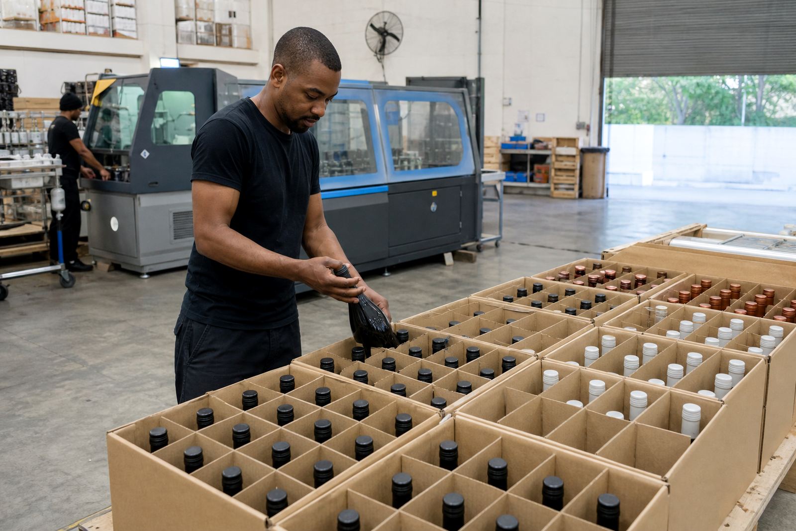
Wedding glass needs a different packing approach from ordinary cartons. Flutes are slender, bottles are heavier, and both need a secure internal layout so the set arrives ready for staging rather than sorting. We prepared the packing with that in mind and aligned the dispatch to the event schedule.
For this order, the client was working from Claremont with delivery arranged into the Cape Town side of the project footprint. The same type of coordination can also support deliveries to Stellenbosch, Franschhoek, Paarl, Somerset West, Constantia, Johannesburg and Durban when the event or gifting plan reaches further afield. Good packaging saves headaches when the glass has to travel.
- Protective packing for flutes and bottles
- Delivery planning around venue timing
- Mixed-item cartons for safer handling
- Coverage across major South African delivery points
What the finished set achieved
The finished wedding set gave the couple a consistent look across the bottles and the flutes, which is what the brief called for. The print held its position across the different shapes and the colour stayed readable against the glass. For an event piece, that visual order matters just as much as the decoration itself.
The project also showed how short-run bottle decoration can still feel considered when the artwork is checked properly and the packing is handled with care. That is the kind of job where small adjustments at proof stage prevent awkward surprises on the table. The result was neat, coordinated and suited to a one-day celebration, not a generic stock run.
- Coordinated look across bottles and flutes
- Artwork suited to curved glass surfaces
- Presentation-ready for wedding tables and gifting
- Short-run finish without over-ordering
What we would set up for a wedding order
On a similar wedding project, the same first steps would make sense: confirm the item mix, check the usable print area on each shape and approve a proof that shows the full set together. That keeps the bottles and drinkware aligned before production starts and avoids mismatched spacing between pieces.
We would also keep the packing brief tight, especially where flutes and bottles travel in the same shipment. Wedding glass needs practical handling, not guesswork, and a clear packing plan reduces breakage risk during movement to the venue or gift coordinator. For Claremont and other Cape Town functions, that part is just as important as the print itself.
- Use one artwork family across all items
- Separate setup for each glass shape
- Approve a full-set proof, not only a single item
- Plan packing before final print release
Key facts
| Project | Claremont wedding bottle and flute run |
|---|---|
| Client type | Wedding couple and event organiser |
| Location | Claremont, Cape Town |
| Decoration methods | UV direct print, screen printing, labels, ceramic enamel |
| Lead time | Scheduled across two weeks, starting at proof approval and ending with dispatch. |
| Items supplied | Branded bottles and champagne flutes |