The Paarl release brief and the bottle format
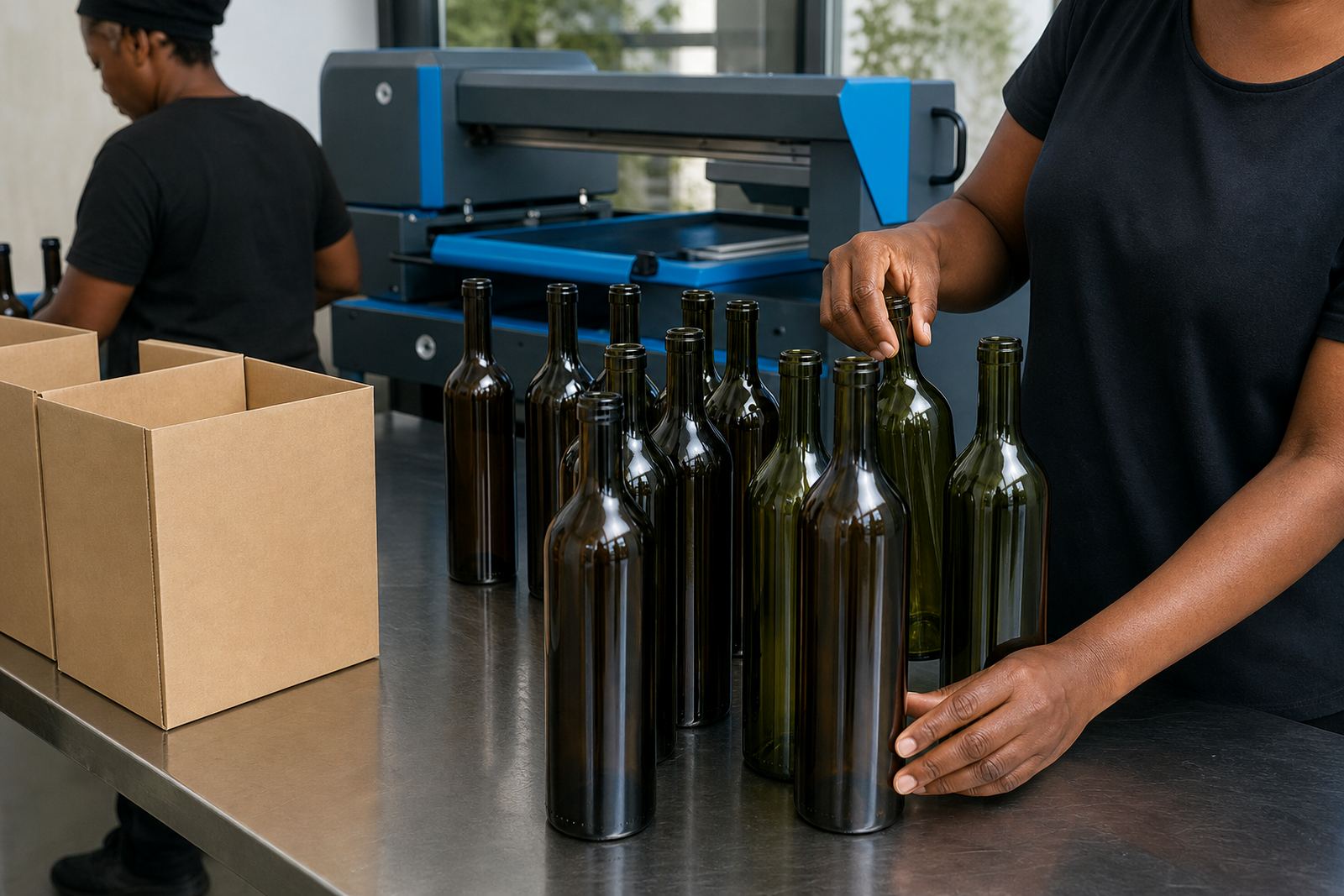
The job came from a Paarl cellar preparing a small release for trade tastings and direct sales. The bottles were standard 750 ml glass wine bottles with a front label zone that had to stay clear of the shoulder curve and the lower glass embossing. The brief called for a neat branded front panel, enough room for the legal text and a finish that looked smart under cellar lighting and on shop shelves.
We set the work up as a short run, which suited the release quantity and kept the pack practical for a cellar team that did not need a large holding of printed stock. The team wanted the bottle front to carry the main identity, with the back kept for required bottle information and batch details. That meant the artwork had to be planned around print area limits, label margins and the shape of the glass, not just the flat artwork file.
Because the bottles were intended for a local release in the Cape Winelands, the finish also had to hold up in a chilled display fridge and during packing, storage and movement between tasting room and cellar. That shaped the choice of decoration method and the prep work around it.
Method, decoration choices and proof control
For this project we prepared the run as a front decoration job using a print method suited to glass bottles and short production quantities. Depending on the exact artwork and coverage, bottle decoration can be handled with UV direct print, screen printing, ceramic enamel or labels. Each method has its own limits on colour density, curve coverage and curing or finishing needs, so the artwork has to be matched to the method before anything goes to print.
The Paarl job used a proofed front decoration plan with a white underlayer where needed to keep colour visible on the glass. That matters on dark or tinted bottles and on clear glass when the design carries lighter tones. We checked the print area against the bottle profile, adjusted the artwork scale and marked the safe zones around the neck taper and base curve.
- Artwork checks covered line thickness, small text size and any fine detail that could soften on glass.
- Print area planning made sure the logo sat square on the front face of each bottle.
- White ink layers were set where the colour needed a stronger base on clear glass.
- Proof approvals were issued before production so the cellar could sign off the final look.
The proof stage kept the job tidy. It let the client see the placement, colour balance and final composition before the run moved ahead, which is useful on bottle work where a few millimetres can change the look of the entire label face.
Artwork handling and production prep in Paarl
The artwork came in as a clean brand mark with supporting text, but it still needed setup for bottle production. We checked the file against the chosen bottle size, looked at the curve on the front panel and prepared a version that suited the intended print method. If artwork arrives with thin rules, small type or colour blends, those details need attention early or they can print unevenly on glass.
Our production team prepared the run in stages. The artwork coordinator handled the layout and proof files, the print technician checked registration and coverage, and the production manager signed off the practical sequence for the bottles and packing. For a short run, that sequence matters because the same bottle profile has to repeat cleanly across the full quantity without drift in position or colour build.
- Label artwork setup was kept separate from the direct print prep so the bottle face stayed uncluttered.
- Minimum run advice was given around the decoration method and bottle format.
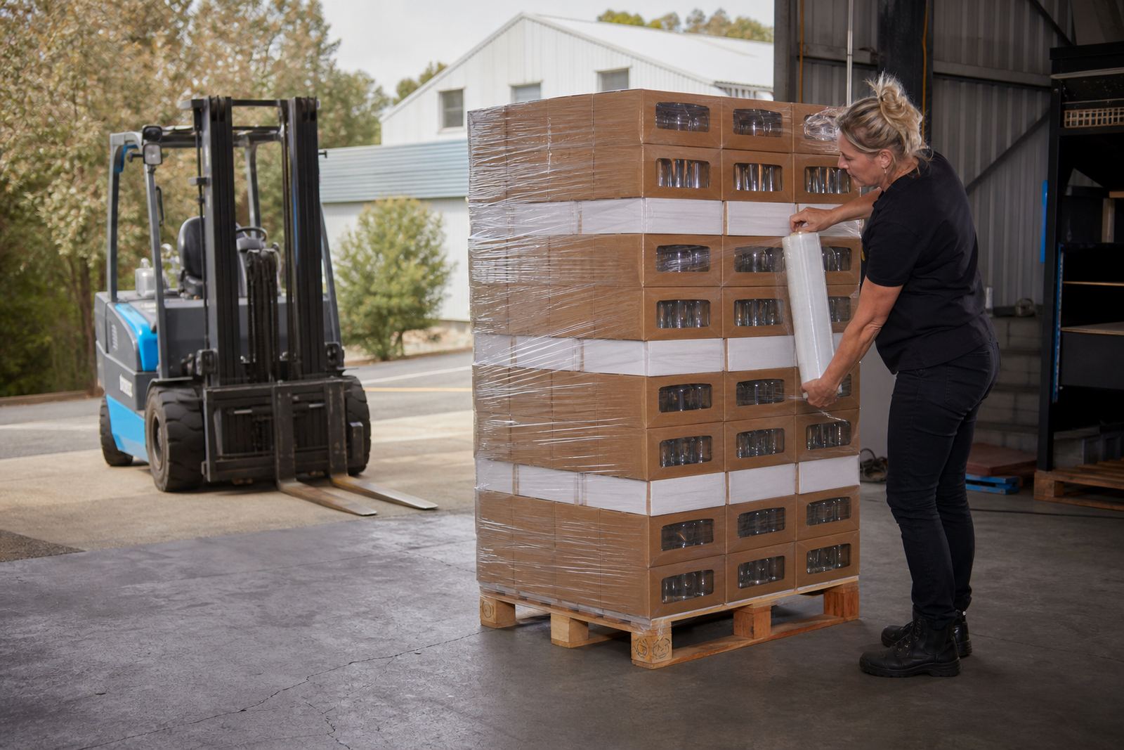
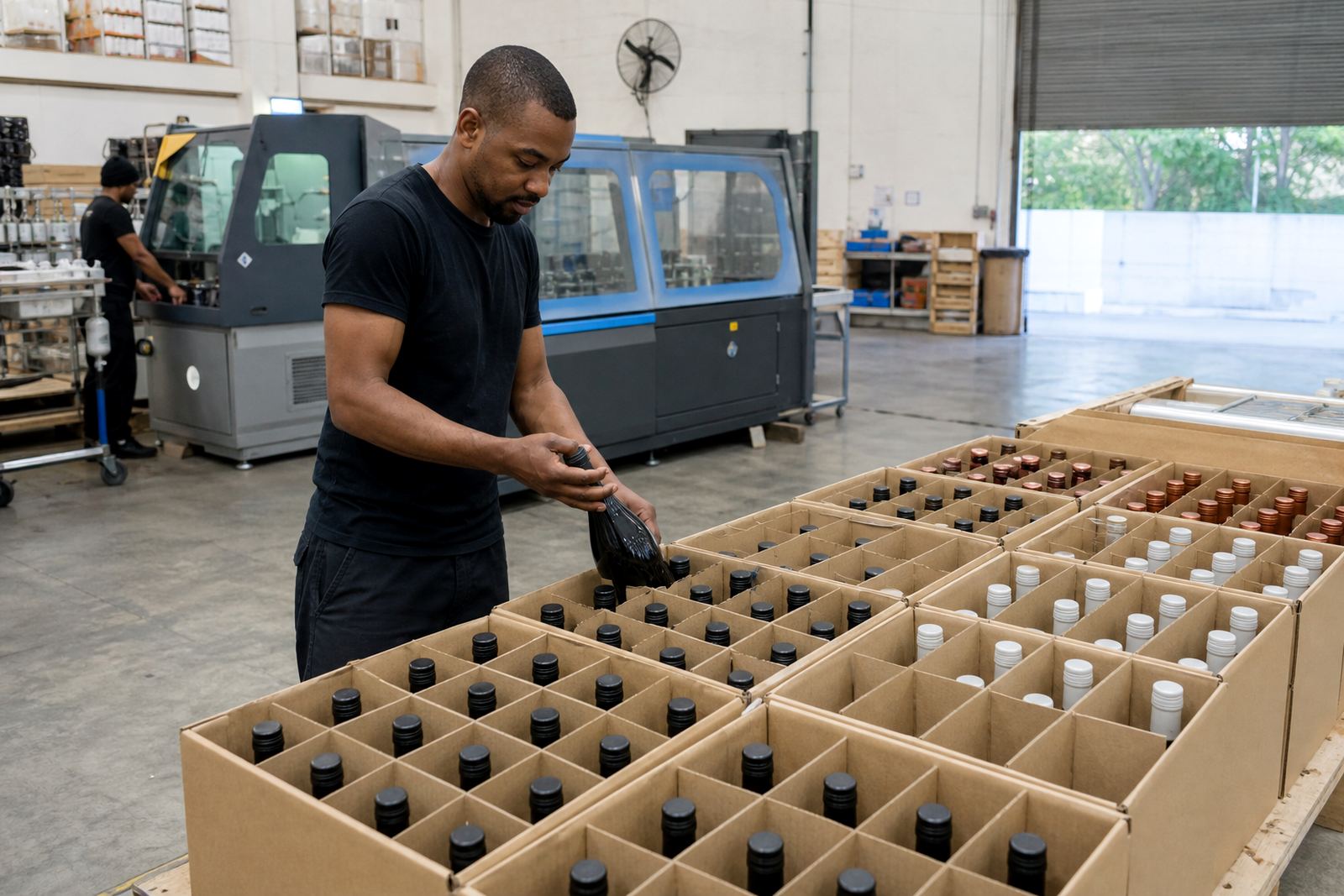
- Packing briefs covered carton counts, bottle orientation and handling notes for dispatch.
- Mock-up visuals helped the client picture the bottle on shelf and in tasting-room use.
The work also needed to fit the legal and practical side of a wine release. That meant enough room for the required bottle information, while keeping the front decoration clear and balanced. Nothing was forced into the design just to fill space, which is usually where bottle jobs start to look crowded.
The run itself and the timing in weeks
The project moved in a short production window of two weeks from final artwork sign-off to packed dispatch. The first part of that window went into proofing and bottle setup, then the print or label stage followed once the layout was confirmed. For a cellar release, that timing gave enough room for the team to work through checks without rushing the finish.
During production we watched colour match, print position and surface finish. Glass bottles can show small shifts under light, so the job was checked under bright inspection rather than only at file stage. The finish had to look even across the group, especially where the front decoration carried the main release identity and the rest of the bottle stayed plain.
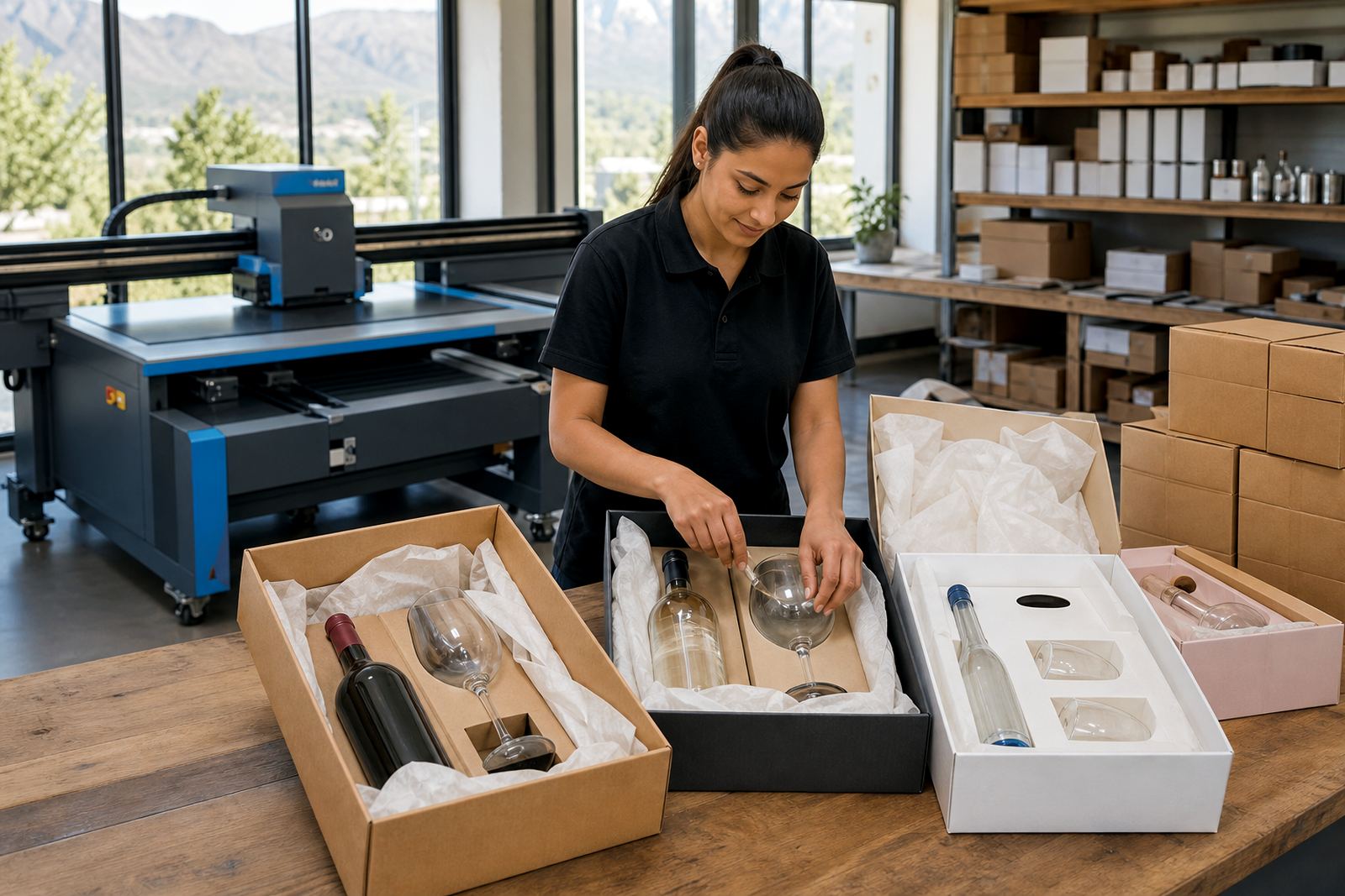
Once printed and cured or finished, the bottles were packed for delivery in a way that reduced movement in transit. The client needed stock ready for a local release, not loose cases that would need more handling at the cellar door. That is where packing notes and carton labelling matter just as much as the print itself.
What the release needed on the shelf
The final bottles held together well as a group. The front decoration read clearly, the colour sat well on the glass and the proofed layout kept the brand mark in a strong position. The release could move into tasting-room use and trade presentation without extra correction on site.
For this type of work, the result is not only about the print surface. It is about whether the bottle still feels balanced in the hand, whether the front panel is legible from a short distance and whether the legal and brand information can live together without crowding. On this Paarl release, those parts stayed in order.
That outcome is helped by matching the method to the bottle and the quantity. Short runs often work best when the artwork is checked early and the print area is planned properly from the start, because bottle decoration does not forgive guesswork. The glass shape, the ink layer and the bottle size all have a say in the final finish.
What we would prepare the same way
For a similar wine bottle release, we would handle the artwork proof first, keep the front panel clean and set the print area against the actual bottle profile before production. That process kept this Paarl job controlled from the start, and it suits most short-run winery work where the bottle needs to carry the brand without looking crowded.
We would also keep the packing brief tied to the release plan, especially where bottles need to move from the print room into cellar storage and then out for local delivery. On short runs, those details save time at handover and reduce handling at the wrong stage.
Where needed, we can also prepare related drinkware decoration for matching tasting-room use, using the same approach to proofing, colour guidance and print-area planning. The job stays practical when each item is set up for its own surface and use case.
Key facts
| Project | Paarl winery run |
|---|---|
| Client type | Cellar release for a Paarl wine producer |
| Bottle format | 750 ml glass wine bottles |
| Decoration | Proofed front decoration with white ink support where needed |
| Run size | Short run |
| Timeline | Packed dispatch followed two weeks after final artwork sign-off |