A cellar brief with narrow print windows
The job came from a Constantia wine producer preparing a modest release for tasting, gifting and cellar use. The bottles needed to look clean from a short viewing distance, with branding kept in a controlled area so the glass still felt like glass and not a fully wrapped surface. That matters on premium wine bottles, where the label, neck finish and printed panel all need room to breathe.
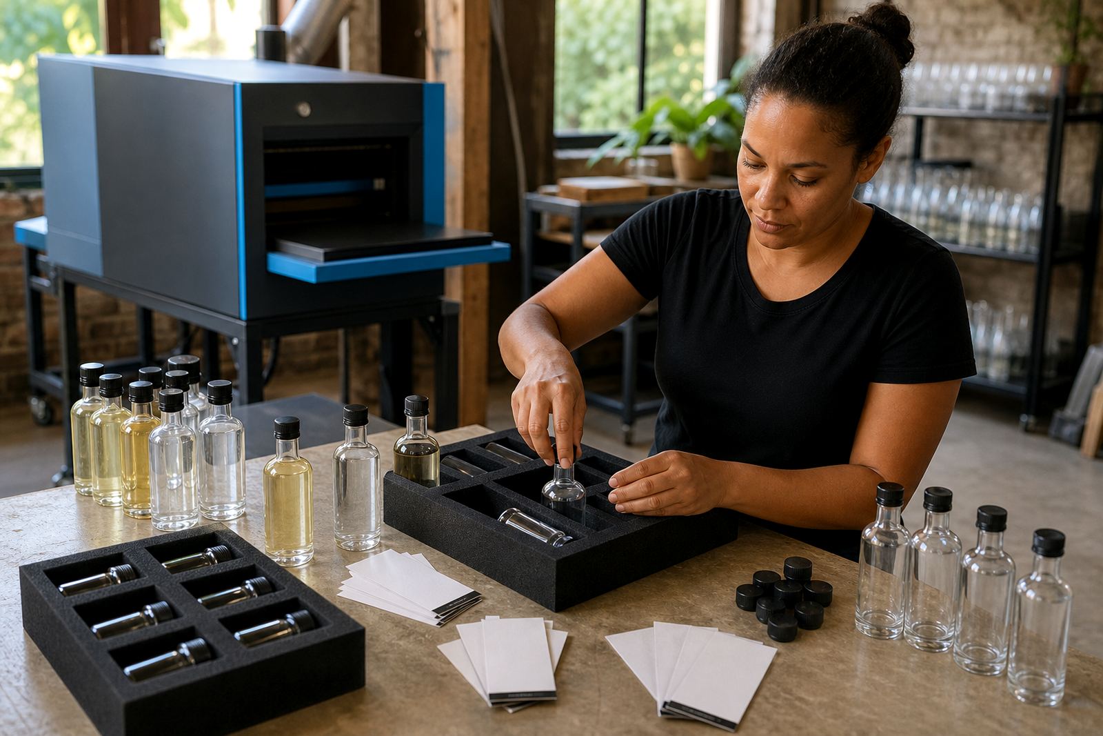
The brief read as a simple one, yet every stage of production had to be watched closely. The artwork had to sit neatly on the shoulder area, the text needed enough contrast against the bottle colour, and the finish could not crowd the fill lines or closure. We also had to work within a short run, so setup needed to be practical rather than overbuilt.
- Client type: Constantia wine cellar programme
- Product: small run of branded wine bottles
- Area: Constantia, Cape Town
- Use: tasting, gifting and cellar presentation
Print methods suited to glass and drinkware
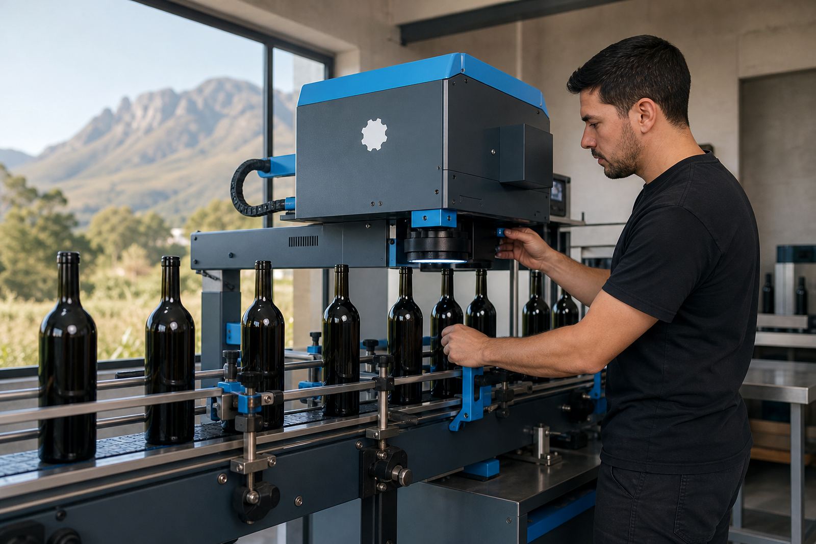
For glass and drinkware runs like this, we choose the print method to suit the surface. On straight-sided glass bottles, UV direct print gives crisp detail and holds fine type well when the artwork is prepared with the right panel size and white underlayer where needed. Screen printing suits bolder artwork and larger solid areas, while ceramic enamel is used when a fired finish is needed on suitable glass. Labels remain useful when a design needs more text, batch detail or a shaped panel that can be applied after print planning.
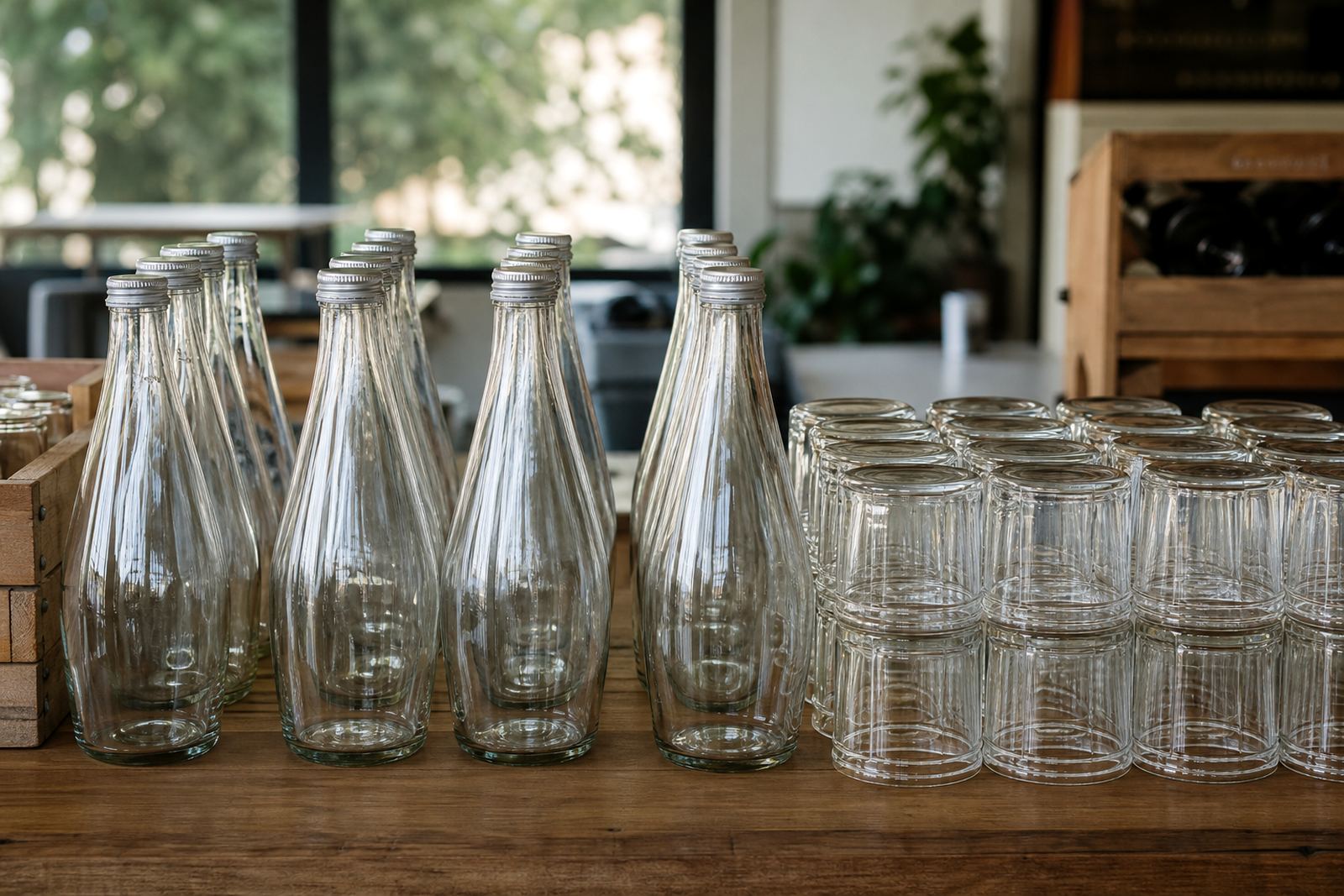
We treat each method differently because the substrate changes the result. Wine bottles, gin bottles and water bottles each behave differently in the machine, especially around curves, embossing and shoulder taper. Drinkware adds another layer of care, since tumblers, stemmed glasses, bottles and reusable cups all have their own printable zones and handling limits.
- UV direct print for sharp detail on glass
- Screen printing for stronger colour blocks
- Ceramic enamel for a fired decorative finish
- Labels for variable copy and layered artwork
Artwork checks before the first bottle ran
The artwork stage carried the main risk on this project, not the press run itself. We checked the print area against the bottle dimensions, adjusted the placement so the logo sat level and confirmed the safe zone around the shoulders and base curve. Small misreads on a bottle can make a neat layout feel off-centre, even when the artwork file looks fine on screen.
We prepared mock-up visuals and proof files showing how the panel would sit on the actual bottle shape. That let the client compare spacing, logo size and text weight before any bottles were printed. We also flagged where white ink layers would help the colour read properly on glass with darker tone or reflection. In short runs, this proofing stage saves a lot of correction later.
- Artwork checks for layout and legibility
- Mock-up visuals for placement approval
- White ink layer guidance where needed
- Print area planning around bottle curves
A short run built around placement control
The run itself was kept tight and practical, with the bottle quantity suited to a smaller cellar issue rather than a nationwide campaign. Short runs need steadier handling because there is less room to hide a registration shift or a slight change in ink laydown. We set the press logic around consistent placement first, then matched the artwork to that plan.
Because the programme was for a Constantia cellar, the finish had to feel restrained. No overfilling of the print panel, no heavy visual crowding, and no awkward conflict with the label zone. The bottles were checked for print position, colour consistency and surface clean-up before packing. That sort of routine sounds ordinary, but on glass the ordinary things are the ones that show first.
- Small volume run for cellar use
- Position checks on every print area
- Colour guidance to keep the tone steady
- Packing brief aligned to bottle handling
Packing, marking and delivery into the Cape Town side
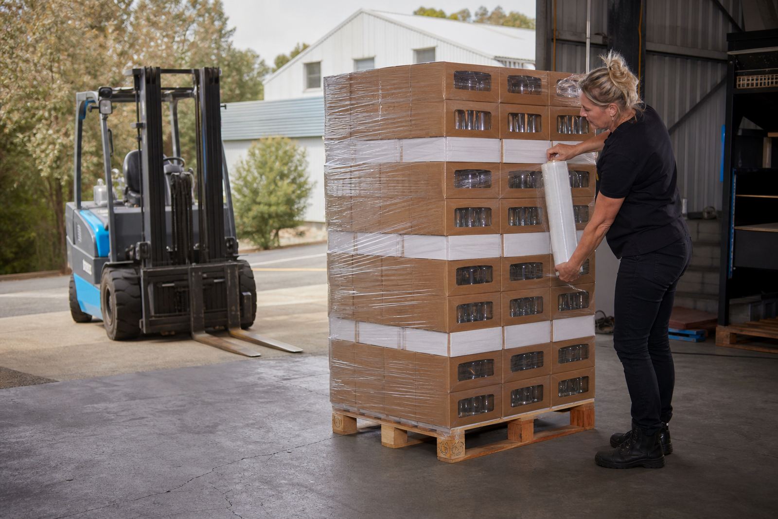
Once the printed bottles cleared checks, we packed them for local delivery with a focus on keeping the surfaces protected in transit. Bottle decoration jobs need careful packing because rub marks, contact points and loose movement can spoil a clean finish before the bottles even reach the cellar. We kept the cartons organised by print lot, which makes receiving and counting easier at the other end.
The delivery pattern suited the Cape Town side of the work, with Constantia close enough for a straightforward handover and the rest of the order route-able across the Cape Winelands and further afield if needed. Our work on these jobs often stretches across Paarl, Stellenbosch and Franschhoek, but the principle stays the same: print clean, pack neatly, then move the bottles without fuss.
- Carton packing by print lot
- Surface protection during handling
- Delivery suitable for Cape Town collection routes
- Full South African delivery available for similar runs
What the finished bottles needed to do
The result was a tidy branded bottle run with the artwork sitting where it was meant to sit. The client had a print finish that read clearly on the shelf and still looked appropriate for a wine setting, which was the point of the brief. For this kind of work, success is less about drama and more about how little the bottle has to fight with its own decoration.
It also showed how useful proof approvals are on short runs. With glass, the bottle shape itself affects the final look, so a well-drawn artwork file is only the starting point. The final print has to respect the curve, the neck, the closure and the space where the label or brand mark ends. That balance held here, and it kept the run calm from setup through to packing.
Key facts
| Project | Constantia Winery Run |
|---|---|
| Client type | Wine cellar programme in Constantia |
| Product mix | Branded wine bottles |
| Decoration method | UV direct print with placement checks |
| Run size | Short-run production |
| Timeline | Planned and produced over a few weeks |