Front-of-house pieces that carry the room
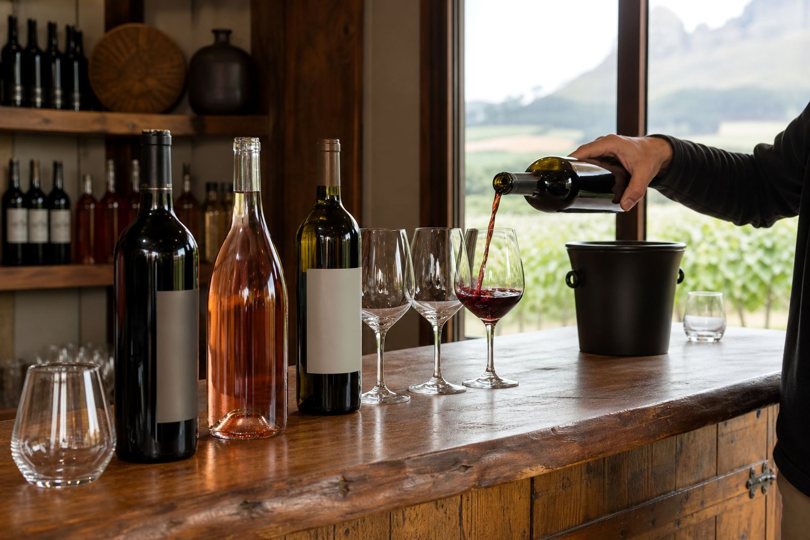
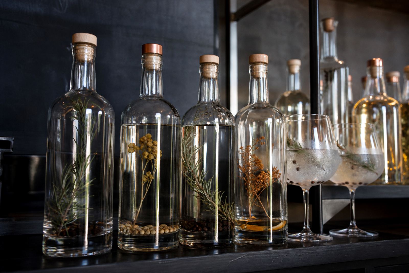
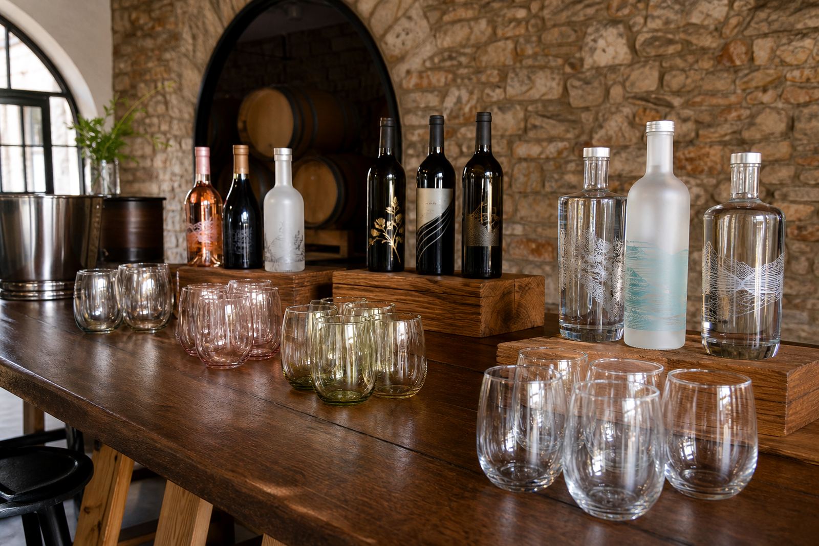
A restaurant range usually needs more than one format. Wine bottles may need a clean label look for house pours, gin bottles often need a stronger front panel mark, and water bottles usually need clear branding that stays legible under warm dining room light. Glassware can follow the same language, especially when the bar pours into tumblers, stem glasses or carafes.
For short runs, the right finish depends on the vessel and the service style. UV direct print works well on coated or treated surfaces where a crisp image is needed. Screen printing suits larger solid areas and strong one-colour marks. Ceramic enamel is useful where the bottle or glass needs a fired finish that stands up to repeated handling. Labels remain practical for bottles that need variable artwork or seasonal changes.
Common bottle and glass types in restaurant service
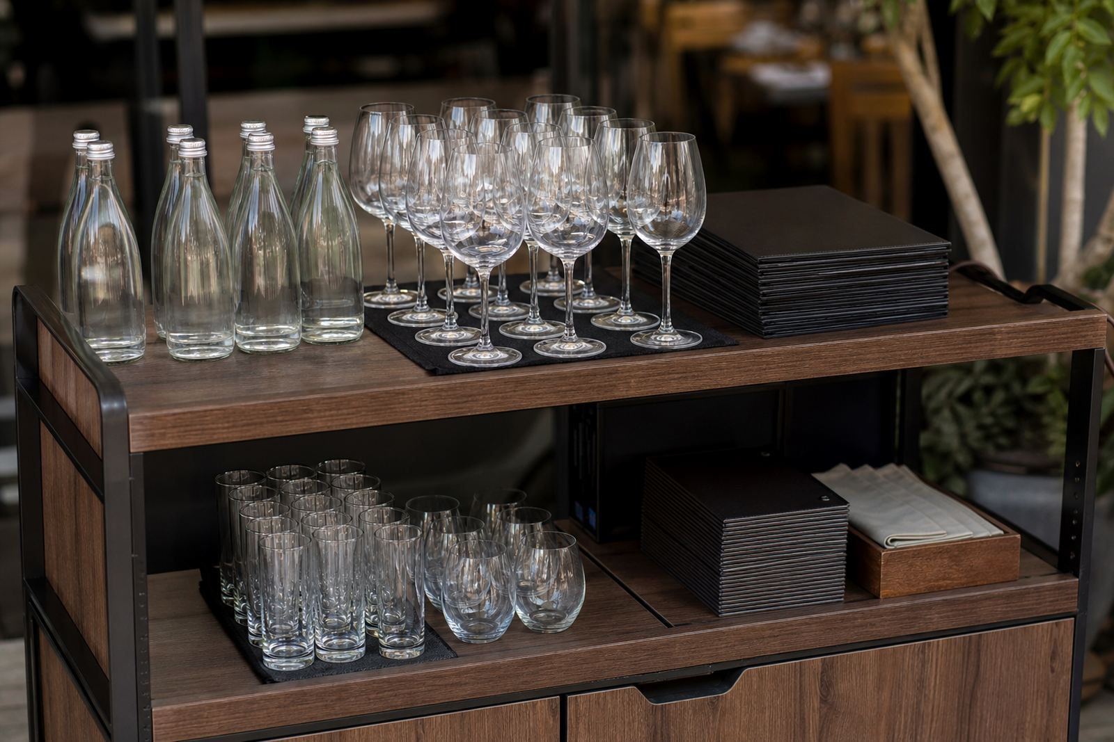
Restaurants usually order a mixed set rather than one single item. That can include standard wine bottles, tall gin bottles, slim still water bottles, carafes, tumblers and stemmed glasses. Some dining rooms prefer clear glass for a sharp look, while others use frosted or coloured glass when the bar wants a softer finish. The decoration method has to suit the shape, wall thickness and print area, not just the logo.
- Wine bottles for house labels and private label pours
- Gin bottles for tableside or bar display use
- Water bottles for still or sparkling service
- Tumblers and stemware for branded glassware sets
- Carafes and serveware where the mark must stay readable
Artwork setup before the first proof
Restaurant artwork is easier to judge when it is mapped to the real bottle or glass. The print area needs to be checked against shoulder curves, neck height and label clearance so the mark does not sit too high or drift around the body. White ink layers matter on darker glass and on some tinted bottles, because colour can drop out if the base is not planned properly.
Restaurant orders get a proof before any glass goes on the press. A visual proof shows placement, size, colour breaks and the way the decoration sits on the vessel. Mock-up visuals help when a restaurant is comparing a clean logo mark with a fuller label layout. That stage also helps with text size, because small print can disappear after washing or handling, sp especially on curved glass.
- Check the print zone against the bottle curve
- Set logo size for viewing at table distance
- Use white underprint where colour needs support
- Separate artwork for label, print and enamel methods
- Approve the proof before production starts
Minimum runs and small batch planning
Short runs are useful when a menu changes often, a seasonal event needs a limited supply, or a dining room wants to trial a new beverage presentation. Minimum run advice helps narrow the order to a size that suits both the vessel and the finish. A label run can often be more flexible than a fired decoration, while direct print and screen work usually benefit from a steadier batch size.
For restaurants, the biggest planning choice is whether the branding must stay fixed or shift through the year. A house wine label, a water bottle mark and a glassware set can all use the same visual language, but each one may need its own setup. Mixing too many bottle shapes into one job can raise the setup work and make the artwork harder to align. Keep the range tidy and the result is cleaner.
Budget bands in rand for restaurant orders
Most restaurant budgets depend on the decoration method, the number of items and how many shapes are included in the run. A small label order on a few hundred bottles will usually sit lower than ceramic enamel or multi colour screen work. Direct print with careful artwork setup can sit in the middle range when the surface is suitable and the print area is clear.
For planning purposes, restaurant orders often fit within these general price ranges:
- Short label runs: about R2 500 to R8 000
- UV direct print jobs: about R4 000 to R15 000
- Screen printed bottles or glasses: about R6 000 to R18 000
- Ceramic enamel work: about R8 500 to R22 000
Those ranges shift with bottle count, colour count, artwork complexity and packing requirements. A smaller order may still need the same basic setup as a larger one, so the mix of items matters just as much as the final quantity.
Mistakes that show up on restaurant shelves
Most issues come from planning, not from the printing process itself. A logo can be placed too close to a shoulder line, a label can crowd the neck wrap, or a glass mark can sit so low that it disappears when the glass is full. Another issue is trying to use one artwork file for every vessel without checking the print area on each shape.
Restaurants also run into trouble when the finish is chosen before the serving style is final. A polished bar bottle may need a tougher decoration than a seasonal event bottle, and a water bottle on a busy table needs simple branding that still reads quickly. Colour guidance helps here, especially where glass tint and lighting change the way the mark appears.
- Using artwork made for a flat surface on curved glass
- Skipping a proof and assuming the first layout will suit
- Overcrowding the bottle with too much text
- Choosing a finish that does not suit repeated handling
- Mixing too many vessel shapes in one order
Paarl production with delivery to dining rooms nationwide
From Paarl in the Cape Winelands, Bottle Printing Co. supports restaurant orders for Cape Town, Stellenbosch, Franschhoek, Johannesburg, Durban, Somerset West and Constantia. Delivery works well for repeat venue groups, launch menus and event service where the bottles and glassware need to arrive packed by location or table set. Packing briefs help separate breakables, label sets and mixed runs.
For front-of-house teams, the useful part is consistency. The same bottle can carry a house mark, a seasonal menu note or a private event detail, while the glassware keeps the bar service tied together. The result is not loud, just tidy and recognisable, which matters when the table is full and the first pour needs to look planned rather than improvised.