A compact brief with a clear front face
The brief came from a Stellenbosch client preparing a limited gin release for local and national use. The bottle had to carry the main brand mark on the front, keep secondary copy restrained, and hold its colour well across a short production run. The look needed to feel sharp in hand and on the shelf, without turning the bottle into a cluttered piece.
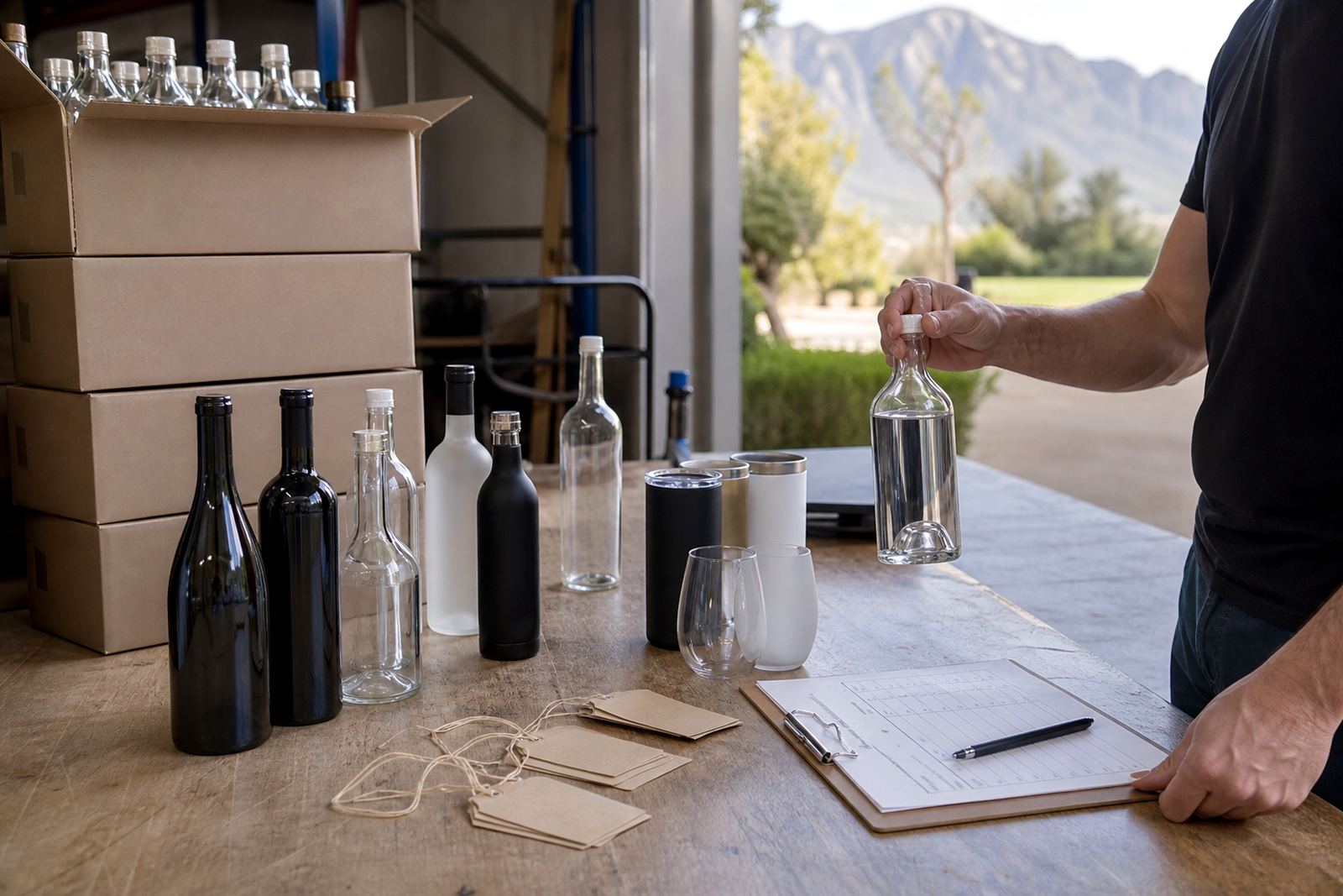
The client wanted a format that worked for gifting and events, with enough presence to stand beside wine and other premium bottles. We discussed the bottle shape, the label area, glass colour and the way white ink would be used to lift the artwork on the glass. The project needed a practical print route, not a decorative one that made the layout harder to read.
- Client type: spirit producer in Stellenbosch
- Product: limited gin release on glass bottles
- Focus: strong front branding and clean handling of small copy
- Use: tastings, gifting and event circulation
Print method choices for a short gin run
We mapped the artwork against the bottle shape and discussed three decoration routes that suit this kind of job: UV direct print, screen printing and labels. UV direct print works well where the artwork needs precise placement and a quick colour build on glass. Screen printing gives a solid, even mark for simpler graphics. Labels are useful where the bottle has a lot of information or where the client wants flexibility across bottle types.
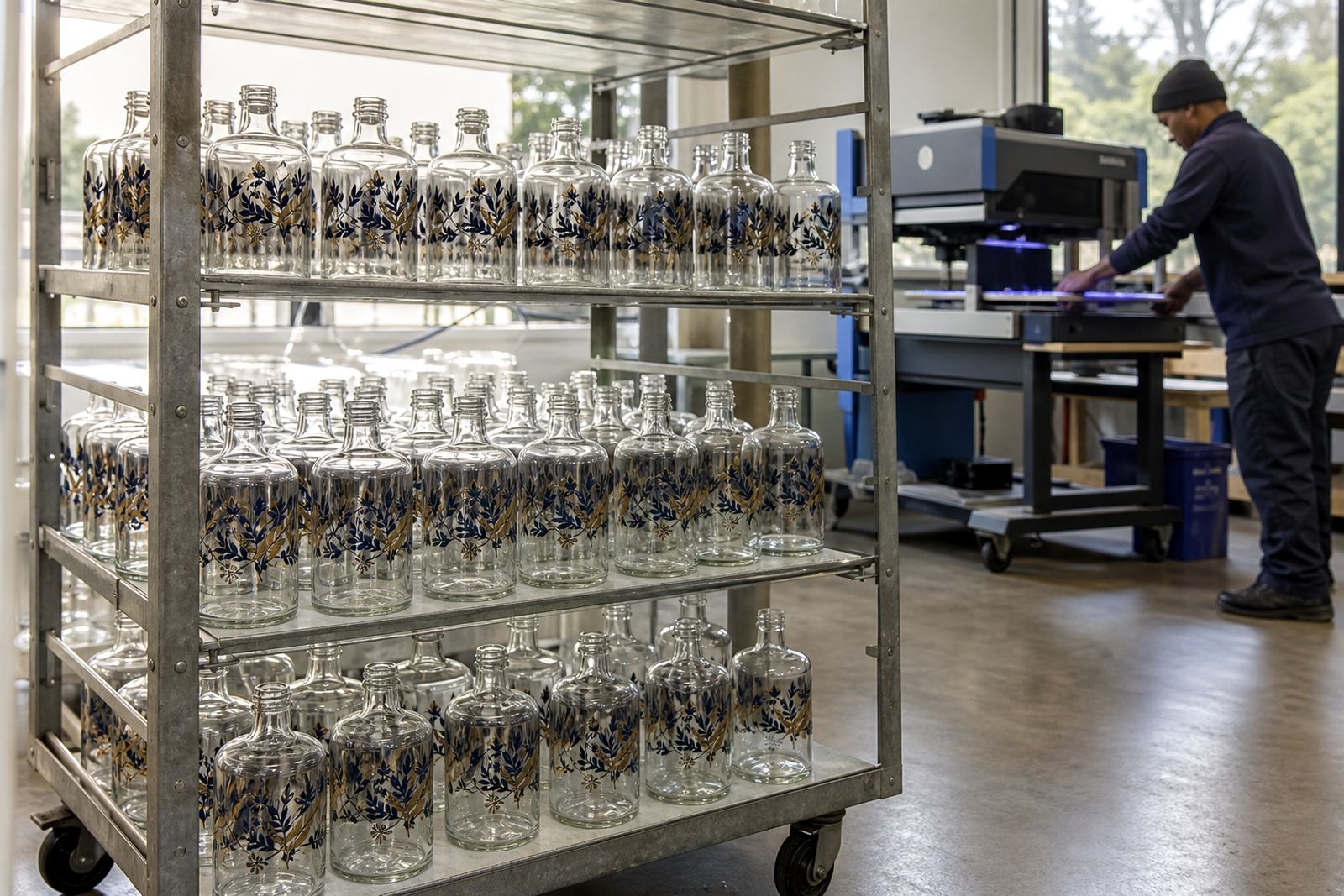
For this release, the front mark needed high contrast and a neat edge on the glass. We planned the artwork with white ink layers so the darker brand colour would hold its weight on the bottle. The front panel was kept bold, while the rest of the bottle stayed clear enough to let the glass do some of the work.
- UV direct print for sharp placement on glass
- Screen printing where a flatter graphic is better
- Labels for variable copy or wider information blocks
- White ink layers to support darker artwork on transparent glass
Artwork control, proofing and the bottle shape
The bottle had a narrow front area and a curve that changed how the eye reads the artwork. That meant the print area had to be set with care, otherwise the logo would drift too close to the shoulder or sit too low near the base. We checked the artwork scale, spacing and any fine lines that might lose clarity once printed.
An artwork proof was prepared before production so the client could review the layout against the real bottle proportions. We also checked how the mark would sit if the bottles were packed close together in cartons. With short runs, small shifts in placement are easier to spot, so the proof stage matters more than people sometimes expect.
The production notes covered the print area, the bottle orientation and the finish order. That included colour guidance, minimum run advice and the packing brief, so the print team and the logistics side were working from the same page. The final artwork held its balance well and did not feel squeezed onto the glass.
Three weeks from brief to packed cartons
The job moved through brief review, artwork setup, proof approval and print preparation over three weeks. That timeline suited a limited release where the client needed time to settle the artwork and confirm the bottle count. The run itself was short, but the preparation still needed proper handling because a small run leaves less room for waste.
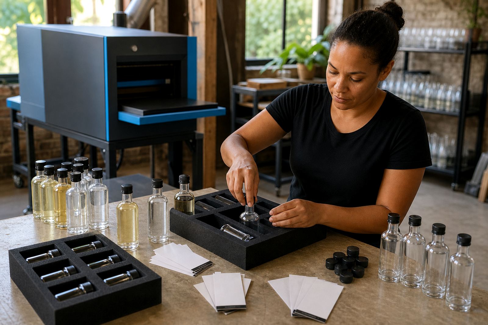
We supplied mock-up visuals so the client could assess the front branding before sign-off, then prepared the print files for the chosen decoration route. Once approved, the bottles moved through production, drying and pack-off. The packing brief was kept tight so the finished bottles would travel cleanly to their next stop.
- Week 1: brief review and print area planning
- Week 2: artwork checks, mock-up visuals and proof approval
- Week 3: production, pack-off and dispatch planning
What the finished bottles needed to do
The strongest result was visual clarity. The front branding stood out without fighting the glass, and the bottle still felt premium in a way that suited a limited gin release. On shelf or table, the mark was easy to read from a short distance, which is often what matters first.
The run also needed practical consistency. Short runs can reveal small differences in registration or colour density, so the print setup had to be disciplined from the start. The finished bottles were packed with care, and the client had a usable stock for promotions, gifting and trade presentation.
- Clear front branding with a premium feel
- Consistent print placement across the run
- Suitable for tastings, gifting and event use
- Packed for transport without rubbing or scuffing
The same handling we would use on a similar bottle run
For a Stellenbosch gin run, we keep the front panel simple, build the artwork to follow the bottle curve and lock the proof before print preparation starts. A short run is best when the layout is disciplined and the print method is chosen for the bottle, not the other way round.
We would also keep the brief focused on the bottle count, the glass type and the intended use, because those details shape how the artwork is prepared. Labels can suit some bottles, while UV direct print or screen printing works better on others. For spirit releases, the best result usually comes from matching the decoration method to the bottle shape and the amount of copy that must be carried.
This project showed how a small gin release can still need careful print planning, especially when the brand wants a strong front face and a clean premium finish. The process held together because the artwork, proofs and packing notes all stayed aligned.
Key facts
| Project name | Stellenbosch Gin Run |
|---|---|
| Client type | Stellenbosch spirit producer |
| Bottle type | Glass gin bottles |
| Decoration methods | UV direct print, screen printing, labels |
| Artwork steps | Artwork checks, mock-up visuals, proof approvals |
| Timeline | 3 weeks from brief to packed cartons |