Stellenbosch runs shaped around tasting rooms and launches
Stellenbosch work usually comes in small, pointed quantities. One month it is wine bottles for a release in a tasting room, the next it is gin bottles for a launch dinner or glassware for a corporate function in town. The bottles tend to need a clean front panel, neat colour control and a finish that still looks good under cellar lighting and on event tables.
For this area we handle short runs on glass and drinkware with the decoration method matched to the surface. Straight-sided bottles suit UV direct print very well, while rounded bottles may work better with labels or screen printing depending on the shape, the artwork and the amount of handling the item will see.
- Wine bottles for release nights, staff gifting and tasting room stock
- Gin bottles for limited batches and presentation packs
- Water bottles for venue service and conference use
- Glassware for tasting counters, launches and private events
What travels well into the Winelands
Stellenbosch deliveries usually move with mixed cartons, proofed artwork and item-specific packing notes. The route from Paarl into town is straightforward, but the end use matters more than the road distance. A bottle for a counter display needs different handling from one that will be packed into hampers or sent out with event boxes.
We cover bottle decoration on glass, coated drinkware and selected promotional items. Clear bottles need careful white ink planning so the artwork reads properly. Amber and green glass can change how a colour sits on the surface, and frosted pieces need a different setup from plain clear glass.
- Clear, amber and green bottles
- Stemmed glassware and tumblers
- Flasks, water bottles and drink bottles
- Matte, gloss and frosted finishes where suitable
Artwork checks before production starts
Most Stellenbosch briefs arrive with a label idea, a logo file or a rough layout from a cellar team, an events organiser or a marketing office. We check artwork for legibility on the chosen container, spacing around curves and whether the colours will hold on the selected decoration method. If the brief needs it, we can also help with print area planning and label artwork setup.
Proofs are issued before any run moves forward. That step matters when the bottle has a shoulder curve, a slim neck or a heavy base that changes how the image sits in view. It also helps where white ink layers need to sit under colour, or where a ceramic enamel finish needs a tighter hand on line work.
- Artwork checks for bottle shape and print area
- Colour guidance for glass and coated drinkware
- White ink layers for clear or dark surfaces
- Proof approvals before production release
Decoration methods that suit Stellenbosch briefs
Different bottle styles need different decoration methods, and Stellenbosch orders often mix more than one. UV direct print works well for short runs where detail, speed of setup and sharp placement matter. Screen printing is often chosen for stronger solid colour and repeat use. Ceramic enamel suits fired decoration on selected glassware, while labels remain useful for shapes that are awkward to print directly or when the design must carry more text.
We look at the item, the run size and the handling the piece will get after printing. A tasting-room bottle may need a finish that stays tidy under repeated display, while a water bottle for event use may need an approach that keeps the branding clear across a wider batch. Small runs are very workable, but the minimum run still depends on the method and the item.
- UV direct print for short, detailed runs
- Screen printing for solid branding and repeated shapes
- Ceramic enamel for selected glass decoration
- Labels for flexible layouts and varied bottle forms
Packing notes for local deliveries and collections
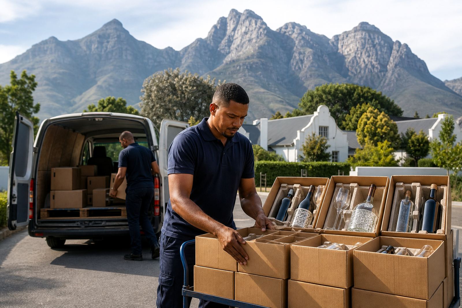
Once the artwork is approved and the print setup is confirmed, we pack according to the container type and the route it is taking. Bottles with longer necks need a different carton layout from short glassware. Breakage risk rises when pieces are crowded, so spacing and internal protection are handled as part of the packing brief.
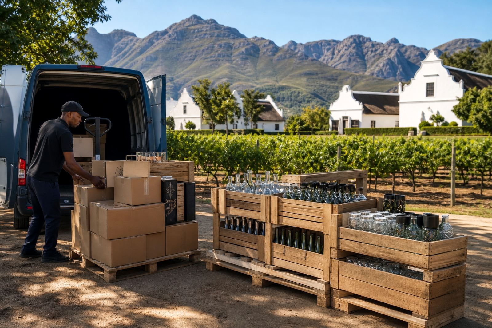
Stellenbosch collections and deliveries often sit alongside other Winelands routes, so timing needs to make sense for loading, checking and handover. Coastal humidity is not a daily issue in town itself, but many customers move stock toward Cape Town, Somerset West or other coastal points where storage conditions can matter more. That is taken into account when labels, inks or packing materials are selected.
- Carton packing matched to bottle height and shape
- Protection for glass edges, shoulders and bases
- Route planning for Winelands and city deliveries
- Handling notes for event stock and retail stock
Starting a Stellenbosch order
Stellenbosch clients usually send through the bottle type, print method preference, quantity range and artwork status. That is enough to check the right production path, whether the job is for a winery release, a distillery launch, corporate gifting or a venue order. We also work with print area planning, label setup, minimum run advice and packing briefs where the job needs more detail.
Stellenbosch briefs arrive by contact form. That keeps the brief in one place and makes it easier to match the product, the finish and the delivery area without guesswork.
- Tell us the bottle or drinkware type
- Include the artwork file or rough layout
- Note the delivery area or collection point
- Mention any label, print or packing preference